Table of Contents
ToggleChoosing exterior paint colors isn’t like picking a throw pillow, it’s a multi-year commitment that affects resale value, neighborhood perception, and your own satisfaction every time you pull into the driveway. A poorly planned color scheme can make architectural details disappear or clash with fixed elements like brick and roofing. Meanwhile, a thoughtful palette enhances proportions, highlights craftsmanship, and makes the home feel intentional. Whether refreshing a tired facade or completing new construction, understanding how colors interact with materials, light, and surroundings separates a successful paint job from one that needs a do-over in three years.
Key Takeaways
- Home exterior color schemes should follow a 60-30-10 ratio using three to four colors to create visual hierarchy while respecting fixed elements like roofing and brick.
- A thoughtful home exterior color scheme can return up to 150% on investment when selling and affects perceived size, architectural style recognition, and energy efficiency.
- Color theory principles including complementary, analogous, and monochromatic schemes help homeowners avoid costly mistakes by understanding warm vs. cool tones and how light affects perception.
- Always test exterior paint colors on 2×2-foot boards across multiple exposures and lighting conditions for three to five days before committing to large-scale application.
- Architectural style guides color expectations—Victorian homes suit three to five colors with bold accents, while Colonial and Contemporary styles benefit from restrained palettes or high-contrast schemes.
- Sheen, primer application, and local permitting requirements are critical details that determine final color impact and project success for home exterior color decisions.
Why Your Exterior Color Scheme Matters More Than You Think
Exterior paint is one of the highest-ROI improvements a homeowner can make, with some studies showing up to 150% return on investment when selling. But beyond dollars, color choice affects perceived size, architectural style recognition, and even energy efficiency, lighter colors reflect heat in hot climates, while darker hues absorb warmth in cooler regions.
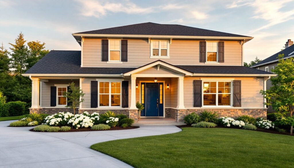
A well-executed scheme uses three to four colors: a main body color covering roughly 60% of surfaces, a secondary or accent color for shutters, doors, or trim (about 30%), and one or two detail colors for brackets, railings, or architectural flourishes (10%). This ratio creates visual hierarchy without chaos.
Fixed elements constrain choices more than homeowners expect. Roof shingles, stone veneers, brick, and concrete foundations aren’t getting repainted, so the palette must complement these permanent materials. A red-toned brick automatically rules out certain greens and cool grays: a charcoal roof pairs differently with beige siding than a weathered wood shake roof does.
Neighborhood context also matters. HOA covenants may restrict bold choices, and even without formal rules, a neon-lime Craftsman on a street of muted Colonials draws the wrong kind of attention, and potentially dings appraisal comps.
Understanding Color Theory for Exterior Paint Selection
Color theory isn’t abstract art-school talk, it’s a practical framework for avoiding expensive mistakes. The color wheel divides into warm tones (reds, oranges, yellows) and cool tones (blues, greens, purples). Warm palettes feel inviting and traditional: cool palettes read modern and serene.
Complementary colors sit opposite each other on the wheel (blue and orange, red and green). Used carefully, they create vibrant contrast, think navy siding with warm copper gutters. Overdo it, and the house looks like a sports team logo.
Analogous colors sit adjacent on the wheel (blue, blue-green, green). These schemes feel cohesive and low-risk, ideal for risk-averse homeowners or strict HOAs. A soft sage body with cream trim and a mossy-green door is analogous and harmonious.
Monochromatic schemes use variations of one hue, different shades and tints of gray, for example. They’re sophisticated but require texture contrast (smooth siding, rough stone, matte vs. satin finishes) to avoid looking flat.
Light affects perceived color dramatically. North-facing facades get little direct sun and can look washed-out in pale colors: they often benefit from warmer or slightly deeper tones. South-facing walls get intense light and can handle cooler, lighter hues without looking dingy. Test samples in all lighting conditions, morning, midday, overcast, and dusk, before committing to five gallons of anything.
Top Exterior Color Schemes for Modern Homes
Classic Neutrals: Timeless and Versatile
Neutral schemes dominate for good reason: they age well, appeal to broad audiences, and let landscaping and architectural details do the talking. A white or off-white body (like Benjamin Moore’s Swiss Coffee or Sherwin-Williams’ Alabaster) paired with black or dark bronze trim creates crisp contrast that works on Farmhouse, Colonial, and Contemporary styles alike. Add a bold front door, navy, forest green, or charcoal, for personality without risk.
Greige (gray-beige hybrids) such as Agreeable Gray or Revere Pewter offer warmth without the yellow undertones that date quickly. Pair greige siding with pure white trim and a warm wood-toned door for a look that translates across decades. These colors also photograph well for listings, a non-trivial consideration in a market where interior design inspiration increasingly drives buyer expectations.
Warm gray bodies with crisp white trim and black window frames anchor modern builds and mid-century ranch renovations. This palette complements metal roofing, horizontal siding profiles, and large window walls.
Bold and Dramatic: Statement Color Combinations
Bold doesn’t mean garish, it means intentional contrast and saturated hues used strategically. Deep navy or charcoal siding with white trim and a natural wood or bright red door suits Craftsman, Tudor, and Contemporary homes. Navy reads nearly neutral from a distance but offers richness up close.
Forest green or deep hunter green bodies work beautifully on homes with natural surroundings, wooded lots, mountain settings, or garden-focused landscapes. Pair with cream or tan trim to avoid a Christmas-decoration vibe, and use black or oil-rubbed bronze hardware.
Terracotta, rust, or burnt sienna tones connect to Southwestern, Spanish Revival, and Mediterranean styles. These warm earth tones pair with cream stucco, natural stone, and clay tile roofs. For a modern edge, use terracotta on accent walls or trim rather than the full body.
Black exteriors (yes, full black) have gained traction on modern farmhouses and minimalist designs. Use white or light gray trim to prevent a monolith effect, and ensure ample windows to balance the mass. Black absorbs heat, so it’s a questionable choice in Sun Belt climates without quality insulation and reflective roof coatings.
How to Choose the Right Colors for Your Home’s Architecture
Architectural style carries color expectations. Fight them at your peril, or at least with full awareness of the visual friction.
Victorian and Queen Anne homes thrive on complexity: three to five colors highlighting trim, brackets, gingerbread, and window casings. Historically accurate palettes included deep reds, olives, golds, and plums. Modern interpretations often lighten the body (soft gray, sage, or taupe) while keeping bold accent colors on details.
Craftsman and Bungalow styles favor earth tones, olive green, warm brown, terracotta, deep gold, with natural wood or stone accents. Trim is typically cream or tan rather than stark white. Front doors in red, teal, or mustard add the signature pop of color common to Arts and Crafts design.
Colonial and Federal homes call for symmetry and restraint: white, cream, soft yellow, or brick-red bodies with white trim and black or dark green shutters. Center the boldest color on the front door (classic red, navy, or Federal blue).
Ranch and Mid-Century Modern homes suit horizontally oriented palettes, monochromatic grays, warm whites, or muted pastels (think pale pink, soft turquoise, or buttery yellow) with natural wood accents and minimal trim contrast. These styles often integrate outdoor living ideas that extend the color story into patios and landscaping.
Contemporary and Modern builds embrace monochrome or high-contrast schemes: white with black trim, all gray with metal accents, or bold single-color statements (charcoal, deep blue, even black). Flat or satin finishes keep the look clean: avoid high-gloss unless going for industrial edge.
Material transitions also dictate color placement. Stone or brick elements are permanent anchors, pull an undertone from the stone (gray, tan, red) and use it in the paint palette. If the foundation is exposed concrete, a darker body color visually grounds the home better than a light one.
Essential Tips for Testing and Finalizing Your Color Scheme
Paint chips lie. A 2×2-inch swatch under fluorescent store lighting bears little resemblance to 200 square feet of siding in full sun. Always test with actual paint samples.
Buy quart-sized samples of top contenders and paint poster board or foam board in 2×2-foot sections (larger is better). Tape these to different elevations and exposures, north, south, east, west, and observe them over three to five days. Colors shift dramatically between morning and late afternoon, and overcast days reveal how schemes read in diffused light.
Test trim and body colors together, not in isolation. A trim color that looks crisp solo may disappear against the body, or create jarring contrast. If the home has stone, brick, or a fixed roof color, hold samples directly against those materials.
Sheen matters as much as color. Exteriors typically use flat or matte finishes on siding (hides imperfections, reduces glare), satin or eggshell on trim (easier to clean, slight sheen defines edges), and semi-gloss or gloss on doors and shutters (durability and visual pop). Higher sheen intensifies color: a satin charcoal reads nearly black compared to flat charcoal.
Consult neighbors, not for permission, but for context. Walk the block and note what works and what clashes. If every house is a variation of beige, a bold choice could be refreshing or out-of-place depending on lot size, setback, and landscaping maturity.
Once finalized, calculate paint quantities accurately. Exterior paint typically covers 250-400 square feet per gallon depending on surface texture and porosity. Measure total wall area (length × height minus windows and doors), add 10% for waste and touch-ups, and buy enough for two coats, the minimum for even coverage and longevity.
Primer is non-negotiable on bare wood, previously dark colors being covered by light tones, or any substrate with staining potential (cedar, redwood, or knots). Tinted primer matching the finish coat improves coverage and color accuracy.
Finally, check local permitting requirements. Most jurisdictions don’t require permits for repainting existing colors, but changing colors dramatically or working on a historic home may trigger design review, especially in historic districts or HOA-controlled communities. Better to ask upfront than repaint under duress.